IBM Planning Analytics for Excel (PAfE) includes a range of tools to help you work with your data more efficiently.
One of the most useful is the Cube View.
What is a Cube View? #
A Cube View allows you to open and explore a cube directly within Excel, rather than using the web interface in Planning Analytics Workspace. This means you can view dimensions and data in a familiar Excel environment, without building a full report. It is ideal for quick analysis, sense checking data and builidn gout report structures.
If you have used Perspectives in the past, this will feel similar to the Explorer function. The key difference is that Cube Views use the newer Planning Analytics interface and include additional functionality.
In this article, we’ll walk through how to open and navigate a Cube View.
Opening a Cube View #
Before opening a Cube View, you will need to be connected to a database within Planning Analytics for Excel. This can be done from the ribbon.
Once connected:
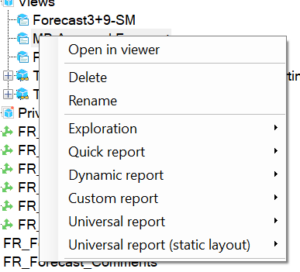
- Navigate to the database tree pane
- Select a cube or an existing view
- Click Open in Viewer
The Cube View will then open in Excel.
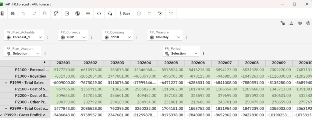
Navigating a Cube View #
The Cube View includes a toolbar and layout areas that allow you to explore and adjust your data.
Toolbar functions #
Here’s what each option allows you to do:
Convert #
The Convert button allows you to change your Cube View into other Planning Analytics for Excel report types, including:
- Exploration
- Quick report
- Dynamic report
- Custom report
Save View #
The Save View button saves the current view back to the cube.
This is useful if you want to reuse the same layout or share it with others.
It’s important to note that this does not save data. Data is saved to the database when it is entered or recalculated.
Formatting Data #
The Format option allows you to adjust how your data is displayed within the Cube View.
Next to this, you will find the option to swap rows and columns, making it easy to change how your data is structured.
Suppress Zeros #
The Suppress Zeros button removes empty or zero-value cells from the view.
This helps to reduce clutter and makes it easier to focus on relevant data.
Recalculate #
The Recalculate button refreshes the data in your Cube View.
You can choose between:
- Manual recalculation
- Automatic recalculation
Automatic recalculation will update data as changes are made, but it can impact performance, so it should be used carefully.
Sandbox #
The Sandbox button allows you to create a sandbox.
A sandbox is a personal copy of the data, allowing you to test changes or create scenarios without affecting the main dataset.
Working with the layout #
Below the toolbar, there are a few key areas that control how your Cube View is structured.
Filter area #
The filter area allows you to filter data using dimensions.
You can select specific members within each dimension to control what data is shown.
Rows and Columns #
The rows and columns area determines how your data is displayed.
You can:
- Drag dimensions into rows or columns
- Swap dimensions by dragging them
- Nest dimensions by placing one next to another
This gives you flexibility to view your data in different ways.
Final thought #
Cube Views are one of the easiest ways to explore data in Planning Analytics for Excel. They provide flexibility, speed, and a familiar Excel interface, making them a great starting point for both analysis and report building.
If you’d like to see how Cube Views can be used in your own reporting, we’re always happy to help.


