COMPARING DATA USING SANDBOXES AS DIMENSIONS IN PLANNING ANALYTICS WORKSPACE
To begin, all you have to do is add EnableSandboxDimension=T into the tm1s.cfg file.
To demonstrate, I’ll be taking on the role of data analyst for Megabeatz Plc. The business is trying to prioritise where to put expansion efforts for their streaming service for the year within the Asia-Pacific market, specifically Japan or South Korea.
Based on previous market research of the genre preferences of each country and the consumption of music online, I will create two scenarios that depict the possible increase in sales value across the Asia-Pacific region for the year. Firstly, I’ll drag my Forecast 3+9 sales review onto the canvas and filter it for the Asia-Pacific member.
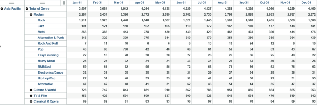
The first scenario will reflect the expansion of Megabeatz Plc to Japan, specifically across the modern genre. Our research indicates that the following genres are popular, and the sales value percentage increase may be as follows:
Hip Hop/Rap – 35%
Heavy Metal – 27%
Electronica – 39%
Pop – 22%
Alternative – 21%
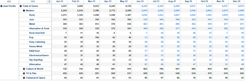
I will now create a new sandbox called ‘Japan’ that reflects these percentages from Jun-31 onwards using data spreading.
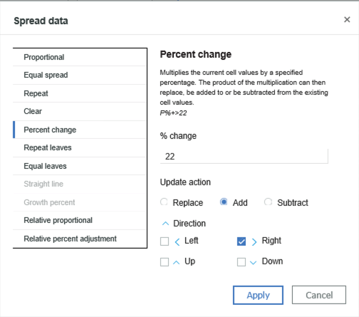
After making the changes, I can see the new numbers have turned blue, which indicates that these numbers have not yet been committed as the base numbers.
I now want to create another sandbox that shows the sales value of South Korea. Based on previous market research, the percentage change per genre In the Asia Pacific market will be smaller than Japan but spread across more genres. I will therefore perform a data spreading operation to increase sales across all of the modern genre by 7.5%.
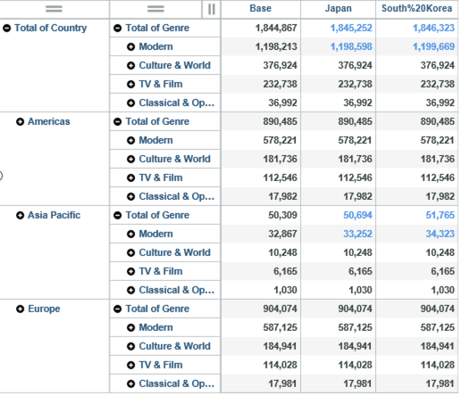
Now that I have my two sandboxes, I will compare them side by side with the base numbers to see which Country will produce the highest revenue. I can do this by expanding the cube called ‘Sales’, then expanding the dimensions.
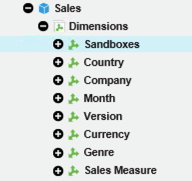
A new dimension has appeared called ‘Sandboxes’ that contains the sandboxes I have created. I now need to add this to a view, so I will drag on the Forecast 3+9 review again, but this time, drag the Sandboxes dimension from the database tree into the column area. I also sort for the forecast year:
I now want to format my analysis so that the differences are clear by showing singleton numbers and adding charts to show the differences:
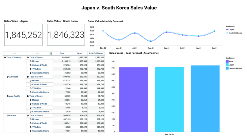
As you can see from the dashboard, it looks like South Korea will produce a higher sales value than Japan. The total sales value figure sits at 1,846,323 for South Korea, which is also shown in the bar chart. You can also see that Japan has a lower sales value. Looking at the line chart, the monthly forecast for South Korea is also higher than Japan.
Based on the information in the dashboard, it looks like Megabeatz will be expanding to South Korea first!
In my opinion, working with sandboxes as dimensions is a simple and quick way to compare data, rather than having multiple views on a dashboard or having to switch between two sandboxes. I will be using this functionality again in order to quickly visualise data and create dashboards that tell an interesting story – I look forward to what IBM has in store in future versions!
To find out more about Planning Analytics get it touch.