The IBM Cognos Analytics Offering team have just released version 11.1.6. The improvements and changes that have been made in this release include:
- Expand or collapse for crosstabs in dashboards
- New data table in report
- Categorical colour in maps
- Measure groups and drill up/down for visualisations
- Enhanced unit formatting
There has also been a change to licencing, Analytics Users can now use the Exploration functionality without the need for the Analytics Explorer licence. This means your users can perform predictive analysis around the data and explore relationships. You can benefit from this if you are on 11.1.x.
Interface and Experience Changes
The first thing to notice is the new icons. They are all in the same place but have been changed in line with IBM’s plans to bring Cognos Analytics and Planning Analytics closer.
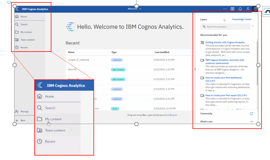
You can now also find the Learn panel on the right, this lets you search across the knowledge centre, community, videos, whats new posts etc. to find the answers you need!
Changes to Reporting
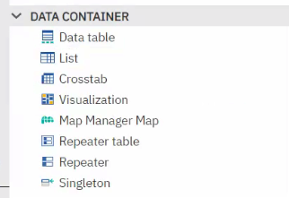
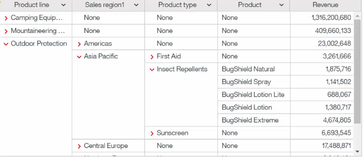
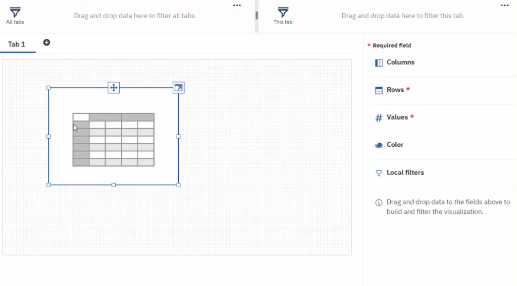
Data Table in Reporting
You will now find the Data table available when you go to the Data Container section when building a report. The Data Table is like a list table but has more functionality, for example you can collapse/expand dimensions, add calculations.
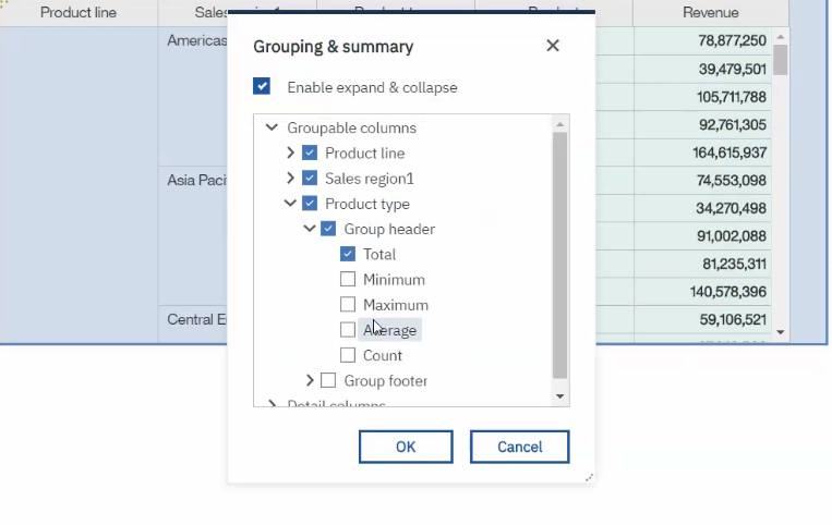
You can also group and summarise as below when using data tables:
Drill in 11.1.x Visualisations
This feature has been bought back to 11.1.x visualisations and means you can now drill up and down on a visualisation.
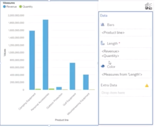
Multiple Measures
For column and bar visualisations the ‘measure group’ function has now been activated. This means you can now drop multiple measures within a visualisation to display them within a single chart.
Changes to Dashboards
Crosstab Changes
Crosstabs now support expand/collapse on cubes, including Planning Analytics, Power Cubes, and Microsoft Cubes, which is helpful when navigating dimensional data.
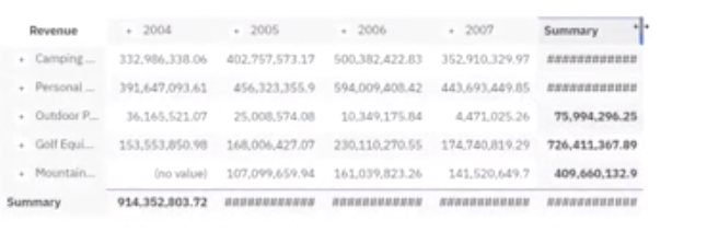
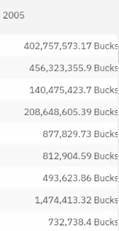
Number Labels
You can also change formatting on the values by adding a number label, for example you could change the label to ‘bucks’:
Data Slots
Data slots have now been fixed to the right. Previously you would have to open a visualisation to change the properties and data slots. If you had multiple visualisations on a dashboard it took time to adjust the individual visualisations as you had to click and expand and change the properties for each visualisation. Now if you want to change multiple visualisations you just click the visualisation and change it in the data slot menu to the right.
Docked Toolbar
Authors can now expect a consistent tool bar at the top of their dashboard, which is contextual based on their selection.
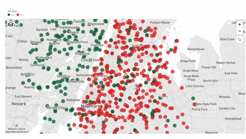
Point Colours on Latitude/Longitude in Maps
You can now put point colours on latitude and longitude on a map so highlight data, the below example shows attrition
R in Notebooks
R is now fully supported in notebooks so you can bring R code snippets straight into notebooks.
Data Modules
Compare tables in a data module to the source to determine which ones haven’t been included, in the same window you can then drag and drop so the table is included in the data module. You can also reload metadata in the same screen rather than having to come out and refresh the server if changes are made or it is updated.
Watson knowledge catalogue integration is also now available.
AI Learning
The ‘AI Learning’ update now enables Cognos Analytics to learn which visualisations you prefer to use. AI learning remembers what you are using specifically around visualisations. If you don’t like a visualisation you can change it to come in as another visualisation. i.e. a word cloud instead of a packed bubble, and Cognos will remember this for next time.
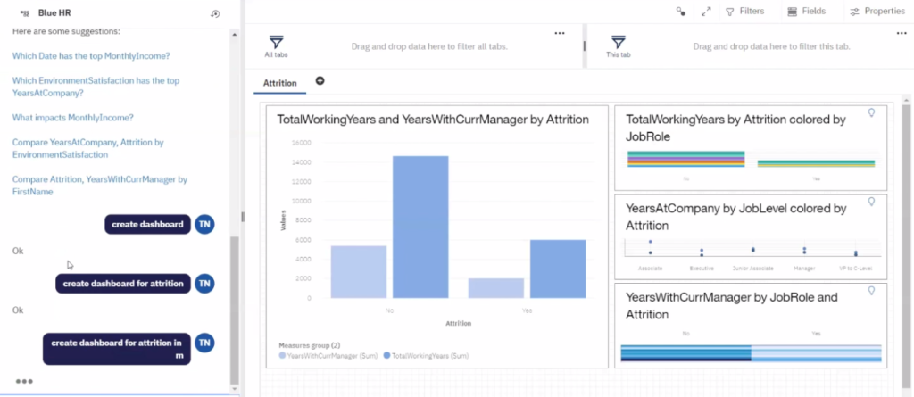
AI Assistant
The ‘Create dashboard’ command has been available in earlier releases than 11.1.6, but there have been some improvements. As well as automatic dashboard generation based on your data, the create dashboard command can now be combined with other parameters. You can see this in the dashboard below with the command ‘Create a Dashboard for Attrition’. This filter is automatically applied, and a new dashboard will be created for attrition. You can also continue adding parameters based on your columns, for example, gender or location.
Explorations
You can now use calculations you have created as the target for an exploration, including calculations you have created within a data module. You can also change the exploration visualisation, for example a spiral chart with a central target.
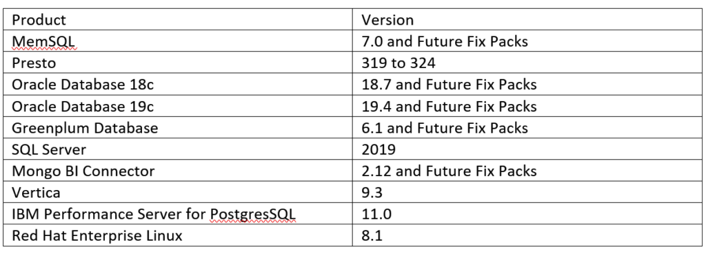
Conformance Points for 11.1.6
The following is a table of compatible software versions: